|
Reflection Project (prisma colored pencils)
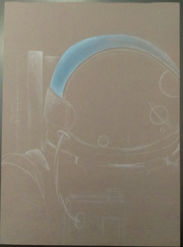
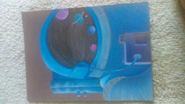
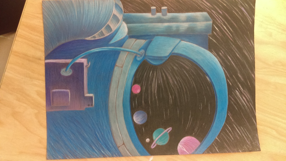
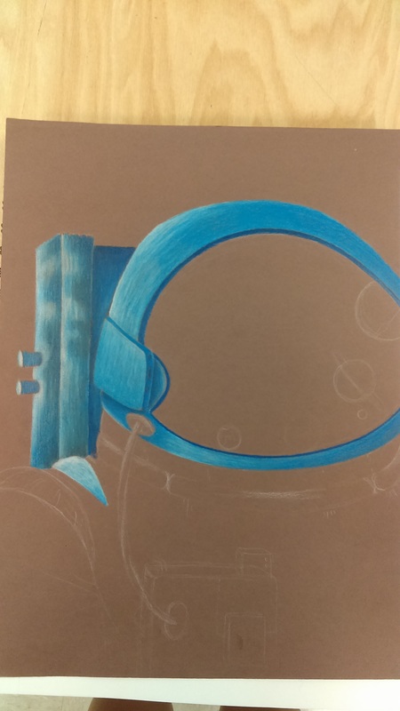
For my reflection project i did a astronaut helmet because I love space. I chose cool colors for this project because I wanted the color of the astronaut's suit to be different from a normal plain white suit. This is my first project using prisma colors and i found it challenging at times not know when to blend. Overall, im proud with my drawing and im sure ill be using prisma colored pencils for future projects. If i would have to improve this project I would probably layer more to get that smooth texture i felt everyone else had. Also, i would have made the planets in the reflective helmet be more oval to make it seem like a real reflection. |
|
Fruit Oil Paintings
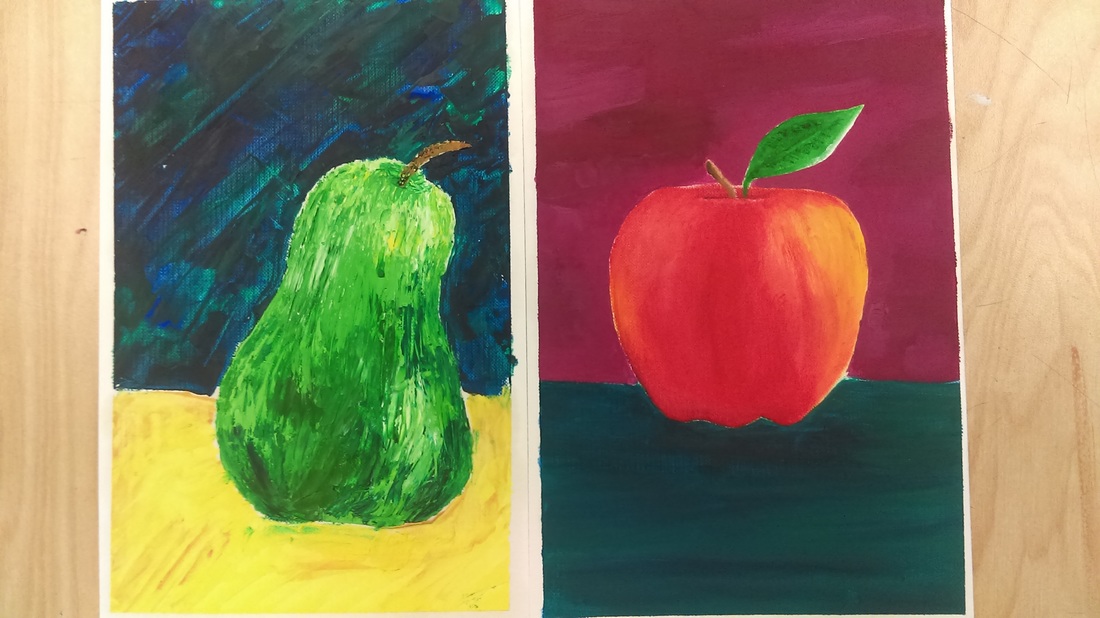
Ive never worked with oil paints before so this was new to me. I like oils more than any other paint ive tried because i feel theyre easier to blend and theyre smooth. On the left is my apple which is painted with a brush, and on the right is my pear which is painted using the palette knife technique. Out of the two i like the pear the best because it looks different/unique. I also enjoyed the process of usuing the palette knife.
Oil Painting Project
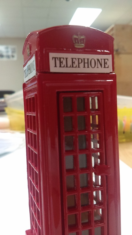
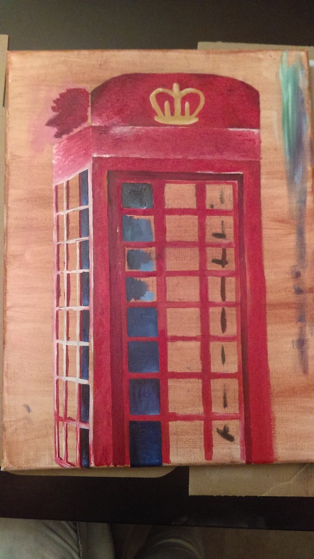
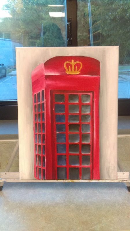
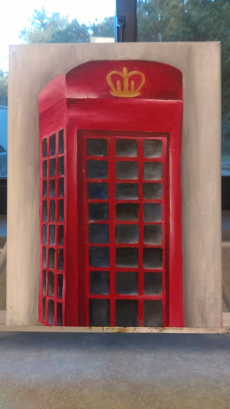
For this project i chose to paint a souvenir that i got in London. I enjoy traveling very much and I was trying to make it as life like as I possibly could.
For this painting I mainly used reds and a lot of white. When I first started putting the paint on the canvas I tried to dab it on to give the painting texture but realized after I had my smooth background it looked a little weird. So, I blended the colors in the telephone box. Also, originally my background wasnt grey and I forgot to take a picture of it before i painted over it. I have refrence pictures from google so you can understand what the background looked like before. It was just to busy and took the focus away from the box.
When I originally sketched this out I had planned on showing a lot of depth within the windows and now that Ive finished i realized there is no depth. Now that ive finished I wish I would of picked a different object to paint because I honestly got bored with the piece and I think i would of enjoyed doing a project with the palette knife.
Mentor Assignment
My "mente" is Riley. Mrs. Rossi assigned her to me a few weeks into class. Im originally from Cary High school so when we started doing this i didnt really understand why. At Cary we never helped out lower art classes so when we started this i thought it was a great idea. I think people grow a lot when theyre surrounded or guided by someone with more experience and such. I know its helped me to be around all the Art 4 people since i skipped Art 3. I think i would of definetly benefitted from having one while i was in Art 1,but thats okay. Im glad i get to help out Riley and give her and advice or motivation she may need.
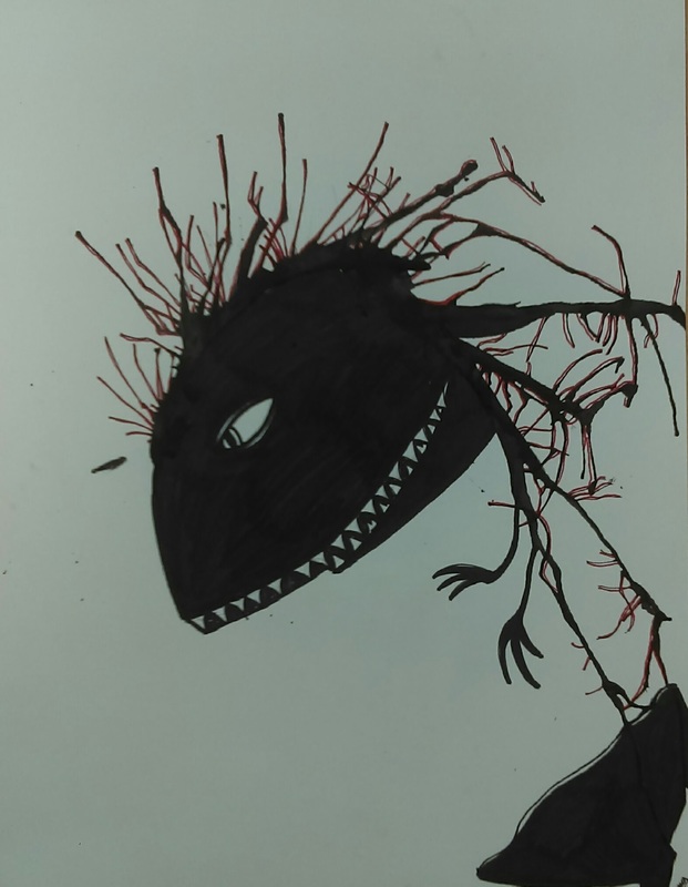
Ink Monster project
For this project, we had to blow ink through straws and create a image with the ink that was splattered. You didnt have to make a monster but I did because i liked the monster drawings that we watched on YouTube in Ms.Sudkamp's room. I created a dinosaur with dance shoes because I wanted it to be funny and scary. I went in with red sharpie and outlined the dinosaur's spikes. I think this is was fun and enjoyed it(:
For this project, we had to blow ink through straws and create a image with the ink that was splattered. You didnt have to make a monster but I did because i liked the monster drawings that we watched on YouTube in Ms.Sudkamp's room. I created a dinosaur with dance shoes because I wanted it to be funny and scary. I went in with red sharpie and outlined the dinosaur's spikes. I think this is was fun and enjoyed it(:
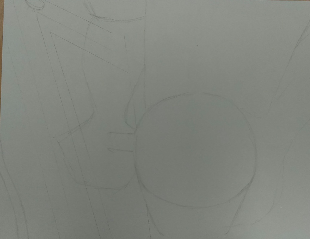
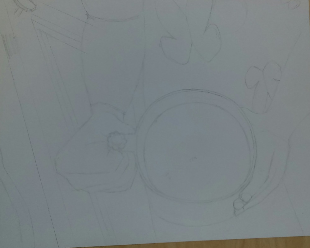
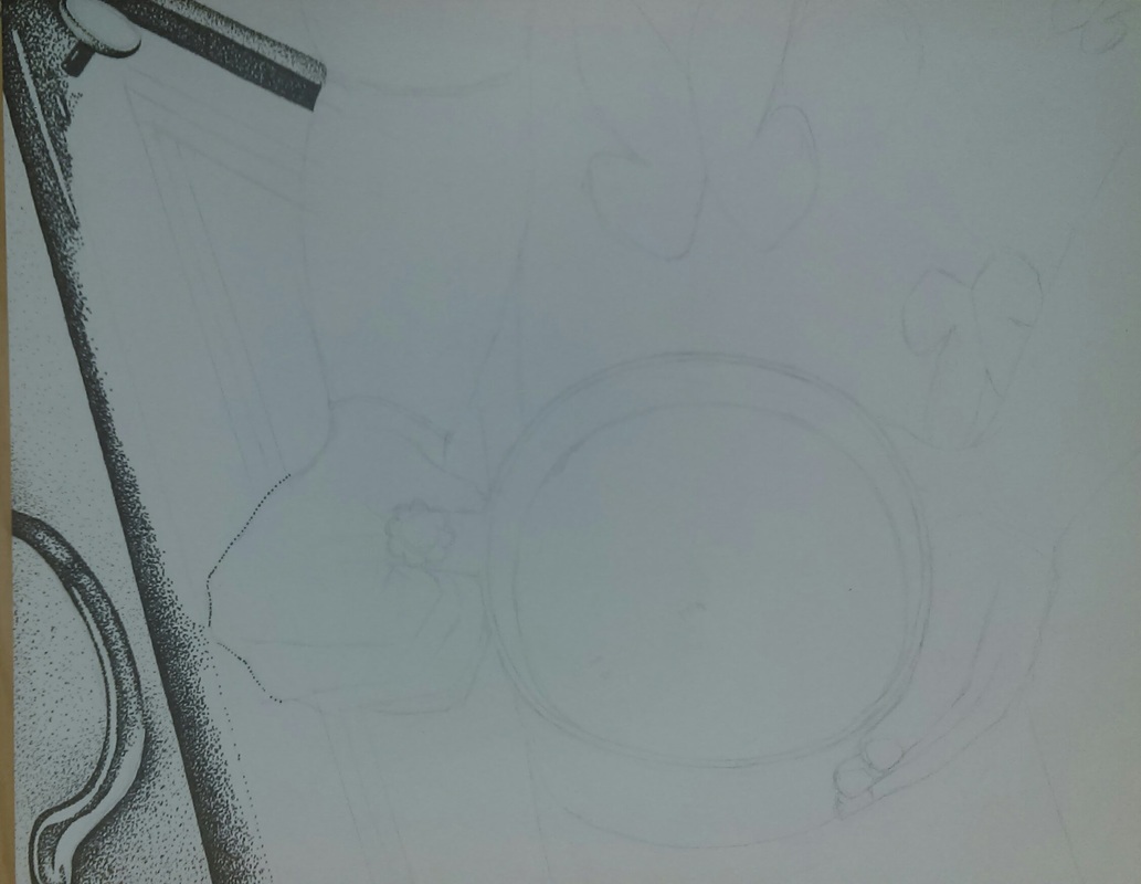
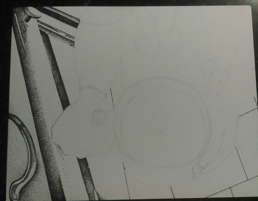
Interior Spaces project
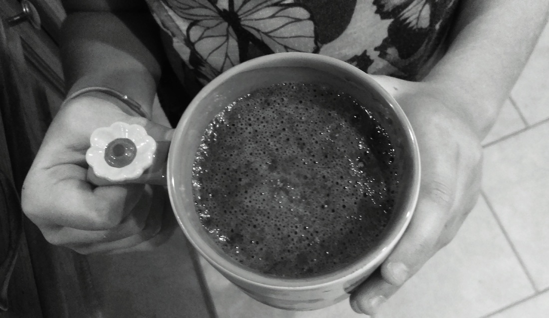
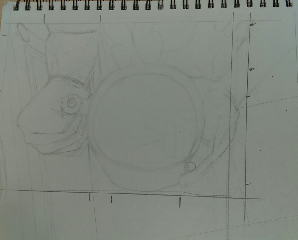
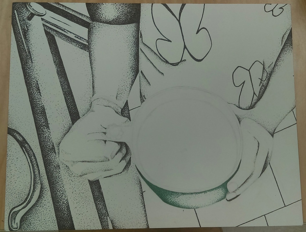
For this project we had to choose to draw the inside of something. I chose to do this picture of my step sister holding a cup of hot chocolate because 1: she wanted me to do a project with her in it, and 2: The hot chocolate was going to be challenging to draw. I chose to do stippling on this piece because that is my favorite method of drawing and it keeps me focused. My plan was and still is to make the cup in color along with the hot chocolate in it.
At first, I sketched out the picture in my sketchbook and had to crop out some of it so the cup wouldn't be dead center. After that i sketched it onto the paper and started stippling in black sharpie. I didn't just use sharpie for the project. I also used pen and micron pens because it adds more detail and depth having different sized dots.
For the hands i had to be careful about the shadows because i really didn't want to mess them up. I think they turned out really well after adding the shadows from the cup (under the handle of the cup).
For the shirt: it was originally just white. I realized it needed depth so i tried to add wrinkles to the shirt. I think the right side of the shirt is a lot better than the left side because the wrinkles on the left i don't feel are as real.
Im making the cup and hot chocolate green and brown. I think the hardest part of this piece is getting the proportion right on this cup. I need to curve the bottom of it a bit more.
Overall I love stippling and this project.

Self Portrait project
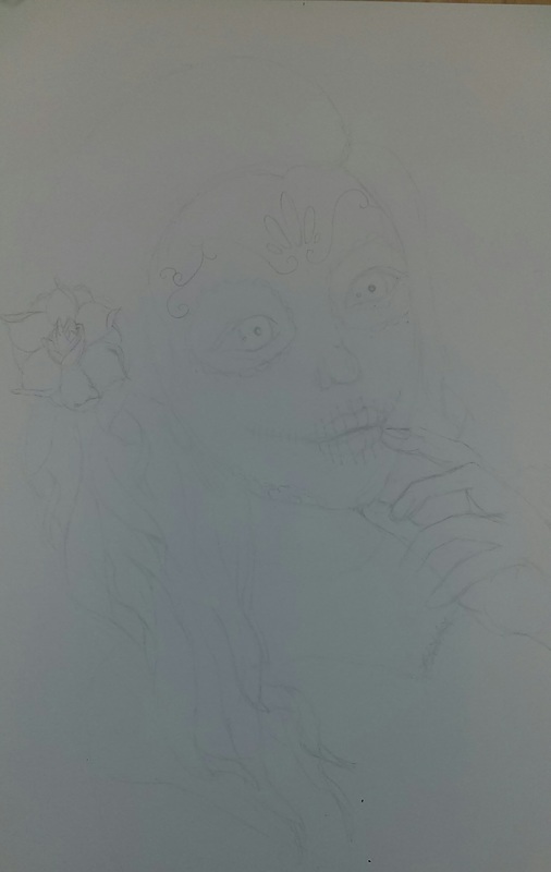
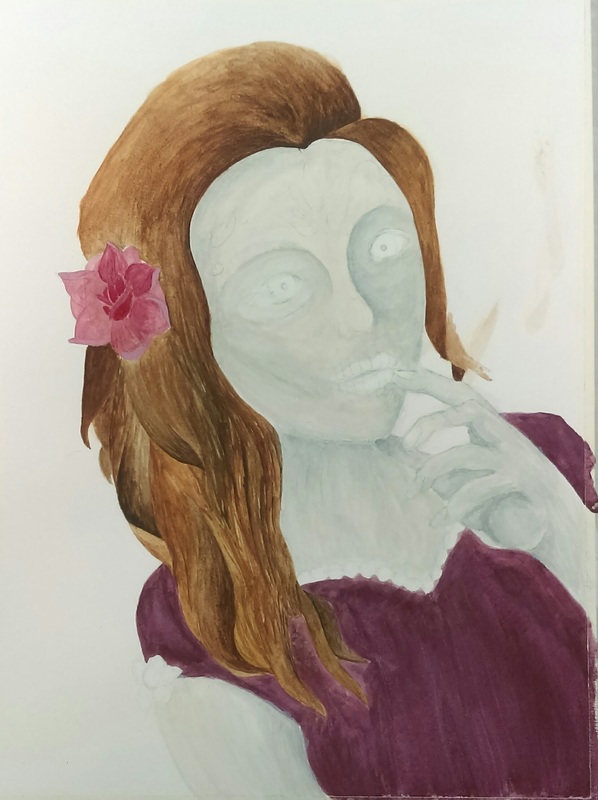
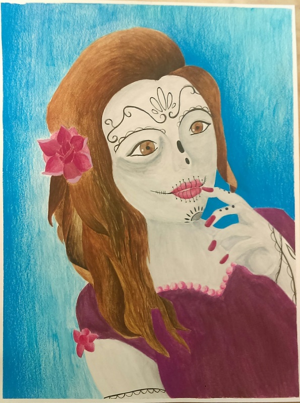
For this project Mrs. Rossi showed us a lot of out of the box examples so I stayed away from the usual self portrait. I sketched myself as a sugar skull (think Día de Muertos). I did the project in watercolor paint and used a lot of different brushes for different things. I also used prisma colored pencils to add depth to my hair and dress.
I started this by painting my body white and then adding light grey for shadows. I didnt choose to make myself peach because sugar skulls are suppose to look dead. I think if i were to go back id most likely push the shadows in my face to make it seem more bony and dead. More skull like.
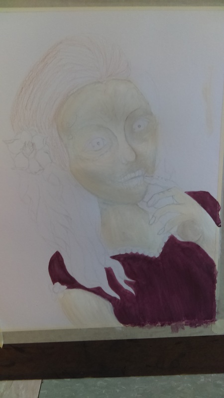
After that, i painted my dress making the mistake of making it to dark. After i finished the whole piece i went back with light purple prisma color and added more shadow to try to fix the dress.
After painting the dress i started the detail on my face with my water brush. The thin tip of the brush created crisp lines for the eyeliner and the stitches on my mouth. Looking at the finished piece I now know need to go back and add eyelashes and clean up the under eye on the right side of the face. Also, i think i need to go add shadows to my neck and chest.
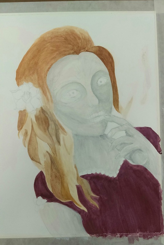
After the face i painted all the hair light light brown just to make a base. I let that dry for a day then added different shades of brown and black, again lightly. After i let that dry for another day, i went back with darker paints to add individual strands and i also went in with prisma colors to add deeper brown to my hair because it looked blonde-ish.
In the process of the hair, i also started on the background. I did it in blue because i feel like reds and blues complament each other nicely. After letting the light blue dry I went in with prisma color to add depth and deeper color.
After this project I realize i dont like watetcolor as much as i thought i did and added the prisma color only made me wish i did it in prisma. I also know what i need to go in and fic such as, shadows, my hand, addition of eyelashes, and my neck and chest. Even though there is room for improvment i still like the piece.
For this project Mrs. Rossi showed us a lot of out of the box examples so I stayed away from the usual self portrait. I sketched myself as a sugar skull (think Día de Muertos). I did the project in watercolor paint and used a lot of different brushes for different things. I also used prisma colored pencils to add depth to my hair and dress.
I started this by painting my body white and then adding light grey for shadows. I didnt choose to make myself peach because sugar skulls are suppose to look dead. I think if i were to go back id most likely push the shadows in my face to make it seem more bony and dead. More skull like.
After that, i painted my dress making the mistake of making it to dark. After i finished the whole piece i went back with light purple prisma color and added more shadow to try to fix the dress.
After painting the dress i started the detail on my face with my water brush. The thin tip of the brush created crisp lines for the eyeliner and the stitches on my mouth. Looking at the finished piece I now know need to go back and add eyelashes and clean up the under eye on the right side of the face. Also, i think i need to go add shadows to my neck and chest.
After the face i painted all the hair light light brown just to make a base. I let that dry for a day then added different shades of brown and black, again lightly. After i let that dry for another day, i went back with darker paints to add individual strands and i also went in with prisma colors to add deeper brown to my hair because it looked blonde-ish.
In the process of the hair, i also started on the background. I did it in blue because i feel like reds and blues complament each other nicely. After letting the light blue dry I went in with prisma color to add depth and deeper color.
After this project I realize i dont like watetcolor as much as i thought i did and added the prisma color only made me wish i did it in prisma. I also know what i need to go in and fic such as, shadows, my hand, addition of eyelashes, and my neck and chest. Even though there is room for improvment i still like the piece.
Landscape
For the landscape project I chose a picture that my mom had taken when she was on her honeymoon in the mountains. The picture was of hills and two trees, one on each side. I chose to do it in oil and use pallet knife and brushes. My original plan was a Japanese blossom tree which I actually draw a lot whenever I can’t find something to draw. I think I didn’t choose this because I didn’t know what I wanted to do with it at the time, whether I wanted to paint it or draw it. Also, I felt like painting something my mom took was more meaningful.
At first I sketched out all the hills and where the trees were going to be and some of the clouds before putting the orange wash on the canvas. After that I started with the pallet knife, doing the hills. I think something I’d do differently is make the strokes different for the hills because they’re mostly horizontal making them look really flat and not giving the picture depth perception. Once I realized that I made each layering hill after the first one darker to see if that’d help and to be honest I’m not sure it did. After I finished with that I started on the sky. I wanted to do the trees and branches last because they were the closest thing in the picture to my mom who took it. I used the brushes o the sky to try to make the clouds wispy and real looking. Clouds is definitely something I’ll be practicing because I don’t think I did a great job on them in this picture. The sky had multiple blues in it and some purple. It was also done in brush. The foliage was in brush and pallet knife. The leaves had an endless amount of colors in them such as red, green, yellow, orange, brown, mustard, ect.
In the end, I think I’ll be re-doing this piece or doing a similar rendition probably over summer or if I’ve got time next semester. Now that I’ve finished I probably should of gone with the blossom tree. I also think that the mix of pallet knife and brush made the piece a little confusing, or at least it did for me. It was odd in some places because when you use the knife you use a lot of paint but when you use the brush you don’t use as much. I’d probably redo the piece just using brush even though I do enjoy the pallet knife. From this piece, I’ve taken it was a learning process and even though it didn’t come out how I would of liked at least I got to practice the pallet knife again and I’m not discouraged to use it again just because of this piece. I also know that I’ve got to practice a few things such as clouds and foliage.
Peep Portraits
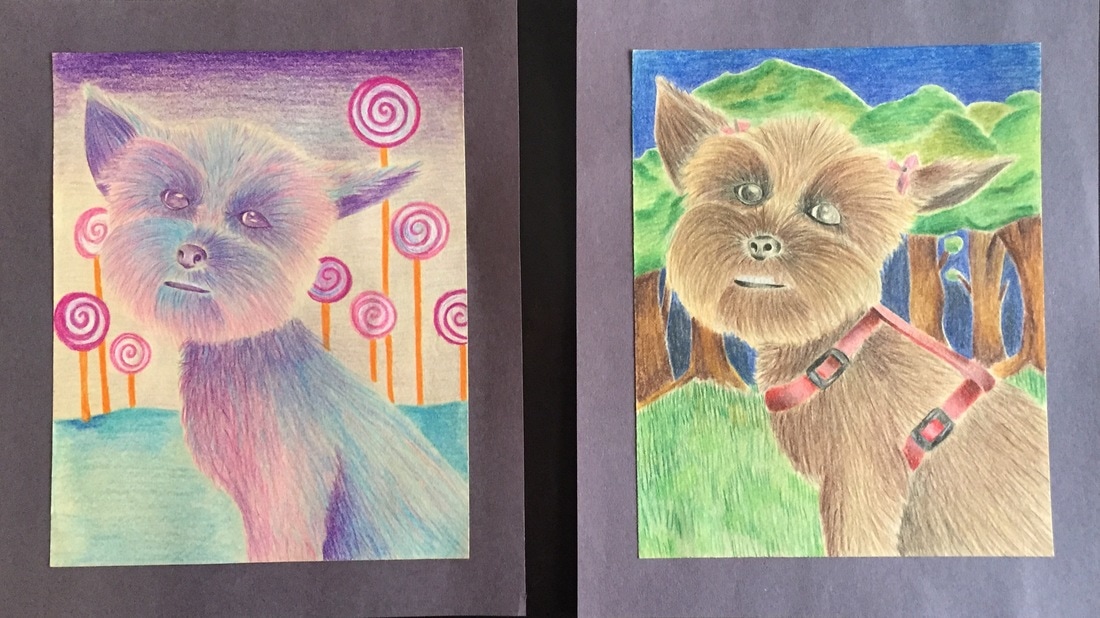
My dog’s name is Peep, we got her five years ago for Easter, and when I heard we were doing pet portraits I got super excited because I’ve never drawn animals before. It wasn’t hard choosing a picture of my dog because her face is basically the same expression in each one.
I had planned to do the project in water color. Actually, I didn’t have much of a plan. I wanted to at least get one in water color, and I did, but it’s not the one I turned in. By the time the due date rolled around I already had four pictures done. The first one was of her outside at night and that was done in water colored pencil along with the one where she looks like cotton candy and she’s in a candy land sort of setting. I also drew one in graphite which is her surrounded by a bunch of pillows on my bed. And, the last one was just her face, no background, and in water color. I didn’t turn the last two in because they didn’t go with the first two which were identical pictures and poses, just different colors and backgrounds. This project was before I got my own set of prisma colors that’s why I was using water colored pencils but they both still turned out very nice. I think the only challenging parts of drawing these were the nose and eyes. The fur was really easy to draw since Peep has straight hair and she had just gotten back from the groomers when the picture was taken. The background had me stumped for a good minute because the background in the picture was her in the car and I honestly didn’t feel like drawing the interior of a car. But, I did like the end result where she’s in the real world and then in a fairy tale land.
Overall I loved this project. I learned that I need to not be so scared to draw dark sometimes because you can tell in a lot of spots where there is like no color at all. Other than that I’m proud of myself for not making the mistake of putting human eyes on my dog (thanks Nory lol) and that for my first time drawing a dog, it actually looks like a dog! Since this project I have sketched a couple other pictures of her and maybe soon I will start drawing other animals.
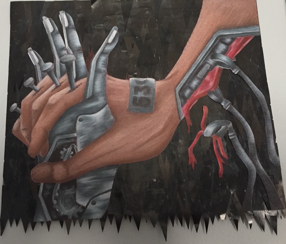
Nature vs. Mechanical
For this piece I really wanted to challenge myself to try a prisma colored pencil drawing again. Also, I felt the theme had an endless amount of ideas to pick from so I tried coming up with an idea that would stand out. At first I wanted to draw a mechanical heart then realized other people were doing that as well. After going through some other ideas I started with something pretty basic that I could build on and would keep me motivated and engaged. Sometimes the struggle with some projects is that I’ll get bored because I picked an idea that doesn’t truly interest me I just couldn’t think of anything else to do at the time. Anyway, I wanted to draw hands. I looked up a few pictures online and saw a picture of people holding hands and I thought, ‘People love technology, so there could be a normal hand and then a really techy-robot looking hand holding hands’. I think this was a pretty good idea but I wanted the drawing to be… more intense I guess. So then that’s when I thought about how people always say robots are going to take over the world someday, and that’s where my final idea came from. I planned to draw a human hand holding a robot’s hand, (because humans love advanced technology and we’re always around and accessible to it), while the robot hand has like robot helpers that are operating on the human hand to ‘fix’ it, turning them into a robot. The nails in the human fingers represent the addiction we have to technology and the ‘fixing’ of the human hand represents how imperfect we are and how we’d give anything to always have technology.
So, making this piece… it took longer than I expected it too. I’ve noticed with other people’s prisma drawings they always manage to get a smooth, creamy look to their drawings and I’ve never managed to do that because I tend to usually draw very lightly (ex. My pet portrait) so this time I had to layer upon layer the colors. Since I only had one grey pencil, and I was taught in art 2 to mix colors to get grey, I used white, black, and light blue. For the hands I used brown, peach, pink, maroon, and a darker brown. I added the pink mostly for highlight, along with peach. You can’t really tell what race the human hand is but I think I like it better that way so that anyone who looks at it can maybe see themselves as the hand. The plate on the hand that is labeled 530 is just to show that this hand is one of many. The background is all magazine paper cut into small triangles layered on top of each other. They were supposed to look like knifes but since they’re all the same color it didn’t come out that way, but I think it still looks really interesting.
In all I think this is my best work and I’m really proud of it. I honestly didn’t think I could do something like this. I think everything’s pretty evenly distributed, there isn’t just one place drawing all the attention and there aren’t colors that are over powering other ones. I think the background is unique since its magazine clippings. Overall, I benefited from doing this project because I got a lot more practice with prisma colors and feel more confident in my art abilities.
Mixed Media
To start, I don't like mixed media pieces. Okay, I think theyre interesting and I do think some people have a real talent making such pieces, but not me. I don't like how you layer and layer paper, and draw all over it, and then splash paint on it if you want. I feel like they look messy and they're just not for me. So, all in all, I tried finishing this piece as quick as I could so I could move onto something else.
This piece is definitely not my best. Far from it. I basically layered tissue paper and magazine pictures. I think the only part i liked was having the blue ribbons and popsicles in it. And, using the bubble wrap. I painted yellow paint onto the bubble wrap and then pressed it against the paper to make circle prints.
So, before I post this picture I'm going to re-do it, and ill put the pictures side by side so you can see how bad the first one was.
Gumball Drawing